Understanding the Interface
Navigate Kanman's interface like a pro. Learn about the sidebar, board view, and key UI elements.
Kanman’s interface is designed to be intuitive and efficient, putting your content front and center while keeping navigation and tools within easy reach. Once you understand the three main areas of the interface, you’ll be able to navigate Kanman with confidence and speed.
This guide provides a comprehensive tour of every element you’ll interact with, helping you understand not just where things are, but why they’re positioned that way.
Main Layout
The Kanman interface follows a familiar three-column pattern used by many modern productivity applications. This layout maximizes screen space for your actual work while keeping navigation accessible.
The layout is divided into three distinct areas, each with a specific purpose:
- Header Bar - The top navigation strip provides global actions like search, settings, and user account controls that are available regardless of which board you’re viewing
- Sidebar - Your navigation hub for switching between boards and accessing quick actions like the trash or settings
- Main Content - The largest area of the screen, dedicated to displaying your board with all its projects and tasks
Header Bar
The header bar sits at the top of every screen and provides quick access to global features that you’ll use regardless of which board you’re viewing.
The header contains these key elements:
- Logo: Clicking the Kanman logo always takes you back to the home screen where you can see all your boards at a glance. It’s a quick escape hatch no matter where you are in the app.
- Search: The global search lets you find any task, project, or board instantly. Press Ctrl+K (or Cmd+K on Mac) from anywhere to open search without reaching for your mouse. Search results appear as you type, and you can navigate them with arrow keys.
- Settings: Opens the settings drawer where you can configure your account, workspace, accessibility preferences, and more.
- User Menu: Access your profile, switch themes between light and dark mode, or sign out of your account.
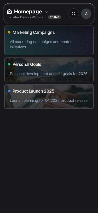
Sidebar
The sidebar is your command center for navigating between boards and accessing system-level features. It stays consistent across the entire application, providing a stable anchor point as you move through your workspace.
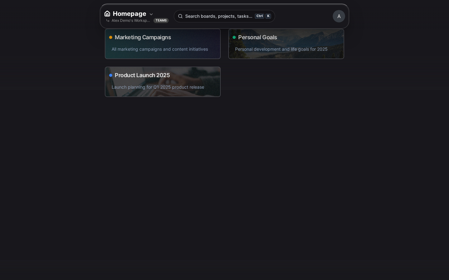
Boards Section
The boards section shows all the boards you have access to, organized in the order you prefer:
- Board List: Every board you own or have been invited to appears here. Click any board to open it in the main content area.
- Drag to Reorder: Organize boards in the order that makes sense to you by dragging them up or down. Put your most frequently used boards at the top for quick access.
- Visual Indicators: Each board shows its icon and name, making it easy to identify at a glance.
- + New Board: At the bottom of the board list, you’ll find the button to create a new board.
Quick Actions
Below the board list, you’ll find shortcuts to system features:
- Home: Returns you to the boards overview page where you can see all your boards as cards. Useful when you want to get the big picture or create a new board.
- Trash: Opens the trash drawer where you can view and restore deleted boards, projects, and tasks. Items stay in trash for 40 days before permanent deletion.
- Settings: Opens the settings drawer for account configuration, workspace management, and preferences.
Collapse/Expand
On smaller screens or when you want more room for your board content, you can collapse the sidebar to just icons. Click the collapse button (double arrow) at the bottom of the sidebar to minimize it. The sidebar will slide in from the left when you hover near the edge or click the hamburger menu.
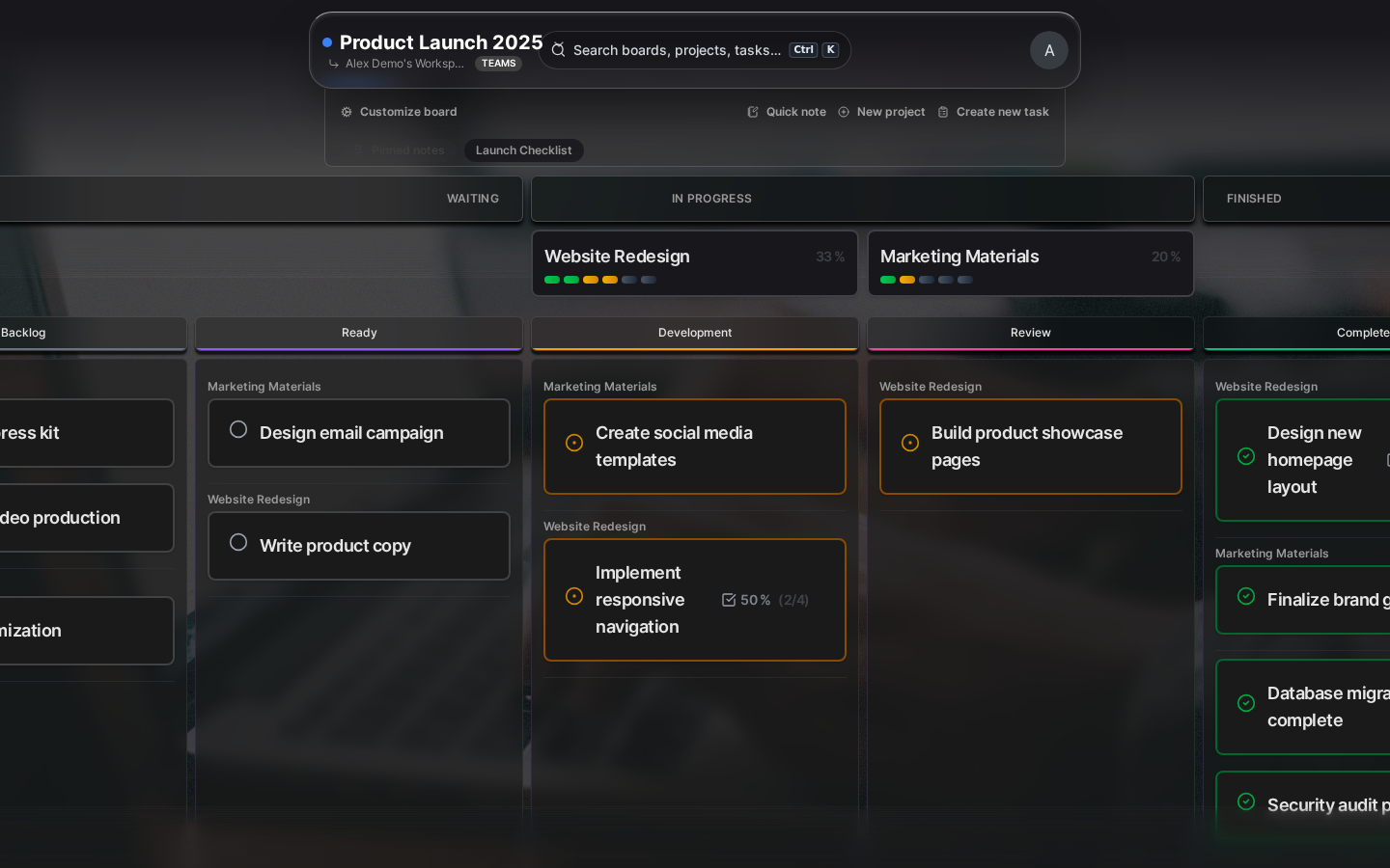
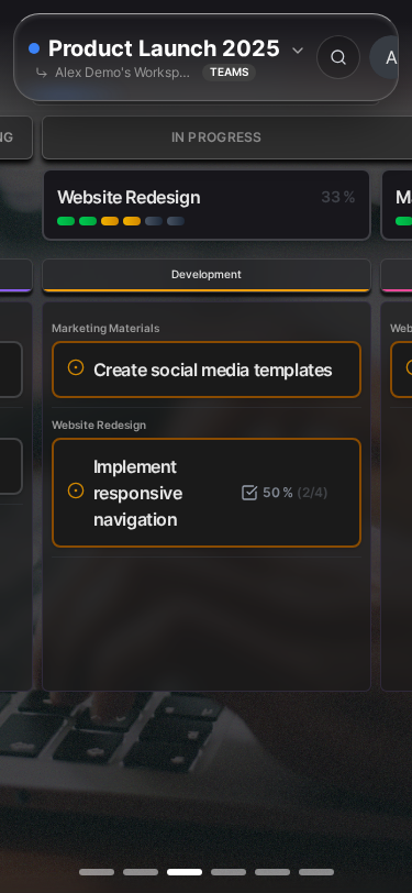
Board View
The board view is where you’ll spend most of your time in Kanman. It displays all your projects and tasks within the currently selected board, and can be switched between two distinct layouts depending on how you prefer to work.
When you open a board, you’ll see:
Board Header
The board header sits at the top of the main content area and provides board-specific controls:
- Board Name: Displays the current board’s name. Click it to quickly edit the name inline without opening settings.
- Settings Icon: The gear icon opens the board settings drawer where you can change the board’s appearance, workflow configuration, and other options.
- Layout Toggle: Switch between Simple view (expandable project cards) and Kanban view (column-based workflow). Your preference is saved per board, so each board can use the layout that works best for its purpose.
- Notes: If you’ve enabled board notes, you’ll see a notes icon that opens the notes panel. Notes are great for documenting project context, meeting notes, or reference information.
Project List (Simple View)
In Simple view, projects appear as expandable cards stacked vertically. This layout works well for task lists, backlogs, and situations where you want to see many projects at once.
- Expand/Collapse: Click anywhere on the project header to expand and reveal its tasks, or collapse to save space. Collapsed projects show a preview of task count and progress.
- Progress Bar: Each project displays a progress bar showing what percentage of tasks are complete, giving you instant visibility into project health.
- Drag to Reorder: Drag projects by their header to reorder them within the board. You can also drag tasks between projects to reorganize work.
Kanban View
Kanban view organizes your tasks into columns based on their status—Open, In Progress, and Done. This visual workflow layout is perfect for tracking work through stages and identifying bottlenecks.


- Drag Between Columns: Move tasks between columns to change their status. Simply drag a task card and drop it into the appropriate column.
- Custom Lanes: Within each status column, you can create custom lanes to further categorize work. For example, you might have “Blocked” and “Ready for Review” lanes within the In Progress column.
- Project Filter: Use the project filter to focus on tasks from a specific project, or view all tasks across all projects in a unified kanban board.
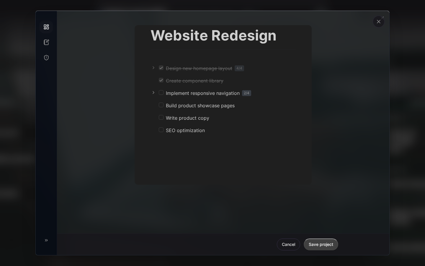
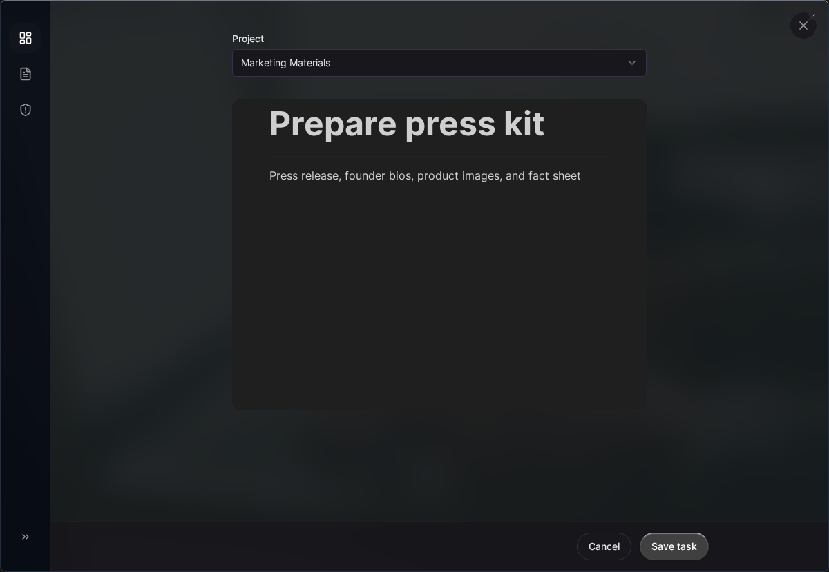
Task Detail View
The task detail view opens as a panel when you click on any task. This is where you can see and edit all the information associated with a task, including its description, subtasks, and metadata.
Task Header
At the top of the task detail panel, you’ll find the essential task controls:
- Task Title: The task name is displayed prominently and can be edited inline by clicking on it. Press Enter to save your changes.
- Status Indicator: A visual indicator shows the current status (Open, In Progress, or Done). Click it to cycle through statuses without navigating away.
- Close Button: Click the X or press Escape to close the detail panel and return to the board view.
Task Body
The main area of the task detail panel contains editable content:
- Description: A rich text editor lets you add detailed notes, formatting, links, and other information about the task. Use this to document requirements, context, or any other details that don’t fit in the task title.
- Subtasks: Break complex tasks into smaller, actionable steps. Each subtask has its own checkbox that you can mark as complete independently.
- Project: Shows which project this task belongs to. Click to move the task to a different project if you need to reorganize.
- Workflow Lane: In Kanban view, tasks can be assigned to specific lanes within their status column. Select a lane here or leave it unassigned.
Actions
At the bottom of the task detail panel, you’ll find task actions:
- Delete: Moves the task to trash. Deleted tasks can be recovered within 40 days from the trash drawer.
- Duplicate: Creates an exact copy of the task, including its description and subtasks. Useful when you need to create similar tasks.
Drag and Drop
Kanman makes heavy use of drag and drop interactions to let you organize your work naturally. Almost anything you see can be rearranged by simply dragging it to a new position.
| Element | What You Can Do | How It Works |
|---|---|---|
| Boards | Reorder in sidebar | Drag a board in the sidebar to change its position in your board list |
| Projects | Reorder within board | Drag a project by its header to move it up or down within the board |
| Tasks | Move between projects, reorder within project | Drag a task to another project or to a different position in the same project |
| Kanban Cards | Move between lanes and columns | Drag task cards between status columns or lanes to update their status and categorization |
All drag operations are saved automatically—there’s no need to confirm or click save. The interface provides visual feedback during drag operations, highlighting valid drop targets to help you place items exactly where you want them.
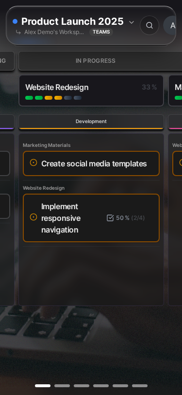
Responsive Design
Kanman is designed to work beautifully across all your devices, from large desktop monitors to phones. The interface adapts intelligently to give you the best experience for your current screen size.
- Desktop (1024px and up): Full sidebar always visible alongside the main content area, giving you quick access to all boards while working
- Tablet (768px - 1023px): Sidebar collapses automatically to give more room for content but can be expanded with a tap. Touch-friendly controls throughout.
- Mobile (under 768px): Slide-out navigation drawer, larger touch targets, and optimized layouts that work well with one-handed use
The mobile experience isn’t a stripped-down version—you can do everything on your phone that you can do on desktop. The interface simply reorganizes to fit the smaller screen while keeping all functionality accessible.
Accessibility
Kanman is committed to being usable by everyone, regardless of ability. We’ve built accessibility features into the core of the application, not as an afterthought.
- Keyboard Navigation: Navigate the entire application without a mouse using Tab, Enter, Escape, and arrow keys. Keyboard shortcuts are available for common actions.
- Reduced Motion: If you’re sensitive to motion or animations, enable reduced motion in preferences. All animations will be minimized or disabled.
- High Contrast: Enhanced contrast mode makes text and UI elements more visible, helpful for users with low vision or in bright environments.
- Screen Reader Support: Semantic HTML and comprehensive ARIA labels ensure screen readers can accurately describe all interface elements.
Configure these options in Settings > Preferences > Accessibility. Your preferences sync across all your devices.
Next Steps
Now that you’re familiar with the Kanman interface, explore these related topics:
- Keyboard Shortcuts - Learn the keyboard commands that will speed up your workflow significantly
- Preferences - Customize theme, language, and behavior to match your preferences
- Core Concepts - Dive deeper into boards, projects, and tasks to master Kanman’s organizational model
Last updated: January 1, 0001
Try Kanman